What makes an office reception sign look right for a business? The best result is not necessarily the largest logo or the brightest lighting. Good reception signage gives visitors an immediate sense of where they are, makes the company name easy to recognise and sits comfortably within the architecture. In a small Shah Alam office, that might mean clean acrylic lettering on a simple feature wall. In a larger corporate lobby, metal letters with carefully controlled illumination may make more sense.
This guide covers practical office reception signage ideas in Malaysia: materials, wall layouts, lighting, dimensions, maintenance and how to brief a sign maker. For custom manufacture and installation, see Elite Sign’s office signage service.
Seven reception signage ideas worth considering
1. Flat-cut acrylic letters for a clean, understated logo
Individual acrylic letters can be fixed directly to a painted wall or raised slightly using discreet spacers. This is useful for short company names, service firms and reception areas where visitors stand close to the sign. The appeal comes from good letter spacing and accurate installation rather than elaborate construction.
Ask about sheet thickness, edge finishing, brand colours and whether the mounting adhesive or mechanical fixings suit the wall. A complex logo with very fine strokes may need a backboard or a modified fabrication approach so the finished parts remain secure.
2. Layered acrylic for logos with more visual depth
Combining a base layer with individually cut letters can create depth without using fully fabricated channel letters. This approach can help separate a logo from a similarly coloured background. It is also practical when the logo has several colours or the wall finish makes direct mounting difficult.
Look closely at how the layers join, whether the panel edges will be visible from the entrance and how the sign can be cleaned. For more on the material itself, our acrylic signage page covers plaque and lettering options.
3. Brushed stainless steel for a restrained corporate finish
Metal lettering offers a different visual character from acrylic. Brushed stainless steel can suit a reception with timber, stone or matte-painted walls, while a mirror finish can look more dramatic but also reflects surrounding lights and furnishings. There is no universally “premium” finish: what looks elegant in a rendered mock-up may become hard to read against a busy wall.
Before ordering, check the letter thickness, material grade, surface finish, fixing method and cleaning expectations. In humid conditions or when a lobby opens directly outdoors, suitable material selection and workmanship are especially important.
4. Halo-lit 3D letters for a softer glow
Backlit or halo-lit letters send LED light towards the surface behind the letters, creating an illuminated outline. The face of the letter is commonly opaque. The visual result depends heavily on the colour and texture of the wall, the mounting gap and whether the light can spread evenly.
A dark textured wall may produce a different effect from a smooth pale wall. Ask to see a night-time or low-light preview and plan for access to power supplies and wiring. Our frontlit and halo-lit comparison explains the differences in construction.
5. Frontlit letters for a brightly legible brand name
If the reception receives relatively little natural light or the sign must remain visible across a broad lobby, frontlit channel letters may be worth exploring. LED modules sit within the letters and illuminate a suitable face. The lettering needs enough depth for even diffusion and must be designed around the logo’s shapes.
More brightness is not always more useful. A reception logo should not create distracting reflections on the counter or dazzle someone entering from a dim corridor. A dimmable system may be worth considering where the specification allows it.
6. A reception feature panel with coordinated lettering
Some offices are better served by a complete feature panel rather than letters mounted onto the existing wall. A panel can create a consistent background, conceal certain fixings and help control contrast. Timber-look finishes, dark neutral panels and lighter surfaces each change how the logo is perceived.
Consider the wall’s structural capacity and any access panels, switches or building services before fixing a large panel. A neat concept should still allow the landlord or facilities team to maintain the space later.
7. Modular reception plaques where names may change
Shared offices, managed suites and multi-tenant buildings may need room names or occupants updated regularly. Replaceable inserts, modular directory components or carefully designed acrylic plaques can be more practical than permanently bonding each name to a wall. The sign’s expected lifetime and the frequency of changes should inform the construction.
Acrylic, stainless steel or illuminated lettering?
| Option | Visual effect | Good fit | Check before ordering |
|---|---|---|---|
| Flat-cut acrylic | Clean, neat dimensional logo | Small offices, clinics, professional services | Thickness, letter spacing, wall fixing |
| Layered acrylic | Multiple colour and depth effects | Branded feature walls, complex logos | Layer alignment and edge finishing |
| Brushed metal | Restrained metallic appearance | Corporate offices, showrooms | Finish, reflections, weight and mounting |
| Halo-lit letters | Subtle glow around letters | Statement reception walls | Wall texture, LED drivers, maintenance |
| Frontlit letters | Illuminated letter faces | Larger lobbies and low-light spaces | Face diffusion, glare, wiring route |
This is a design comparison, not a price ranking. A simple metal logo may cost differently from a complicated acrylic logo because fabrication, number of parts, lighting and installation conditions all matter.
How big should an office reception logo be?
Start by measuring the usable wall width and height, then look at the space from the entrance rather than only from behind the counter. The logo should not disappear behind people standing at reception or compete with other wall features. Allow breathing room around the letters and check sightlines from any waiting area.
For example, a long company name may look more balanced with a restrained letter height than a short symbol placed at the same overall width. Ask for a scaled drawing showing the sign in its actual wall position, with an indication of the counter, ceiling and nearby fixtures.
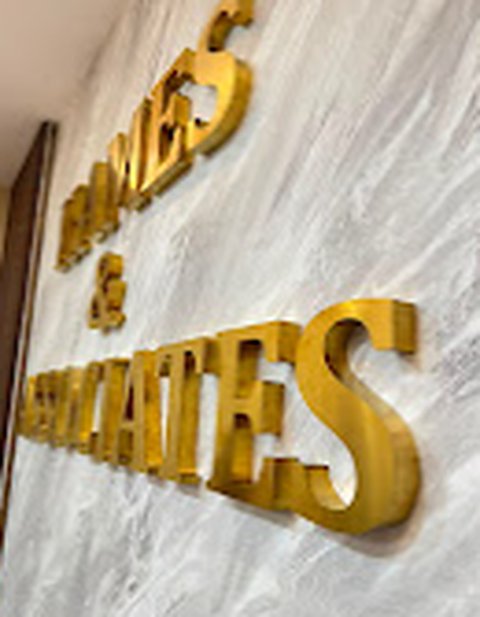
Real-world photo: dimensional letters on a feature wall
The photograph above is from Elite Sign’s image library. It illustrates a material-and-layout approach, not a claim about a particular customer’s budget or the performance of the installation. If you are collecting ideas, our signboard gallery offers additional examples.
Reception branding versus building wayfinding
A reception logo and a wayfinding system solve different problems. The logo tells a visitor whose office this is. Directional and room signs tell the visitor where to go next. Avoid turning the main reception wall into a directory containing every department and arrow.
For multi-floor premises, look at the entire visitor route: entrance, reception, lifts, corridors and meeting rooms. Typography, directional arrows and naming conventions should be consistent. For those needs, see our indoor signage and wayfinding service.
Accessibility also matters. Sign contrast, legibility and placement should consider visitors with different needs. Malaysia’s Department of Standards Malaysia publishes MS 1184 guidance on universal design and accessibility in the built environment; review the applicable version and project requirements rather than relying on a decorative signage example as a compliance specification.
Where budgets can change unexpectedly
The total quotation depends on more than the visible letters. Site access, installation hours, wall condition, electrical provision, backing construction and number of individual pieces can all affect the scope. A large lobby may need special access equipment; a glass partition may require a different fixing solution from brick or concrete.
Before comparing quotations, ask whether they include design preparation, sample approval, final measurement, fabrication, electrical work, delivery, mounting and any subsequent adjustments. Request an itemised description of materials and finishes.
What to send for an office reception signage quotation
- Photographs of the reception wall from the entrance and from the counter.
- Approximate usable width and height, plus the wall material if known.
- Logo files and any brand guidelines, including preferred colours.
- Whether the sign should be non-illuminated, frontlit or halo-lit.
- Building access times, lift restrictions and landlord requirements.
- Your installation address in Shah Alam, Selangor or the surrounding area.
If you are unsure of the construction, describe the impression you want visitors to have and show one or two style references. The fabrication approach can then be discussed without promising a material or lighting outcome that the actual wall cannot support.
Elite Sign designs, fabricates and installs custom office signage for businesses in Shah Alam and Selangor. Send your logo and reception photos to discuss a suitable design and quotation.
Frequently asked questions
Which material is best for an office reception logo?
It depends on the wall, brand style, budget and lighting. Acrylic can suit clean dimensional lettering, while metal changes the finish and weight. Illuminated letters add electrical and maintenance requirements. Request a scaled mock-up before selecting the final construction.
Do reception signs need LED lighting?
No. A non-illuminated logo can work well under existing indoor lighting. LED may help in a larger or darker area, but it should not create glare or make future maintenance difficult.
Is an office reception sign the same as an office directory?
No. Reception branding identifies the business; a directory provides navigation. Larger buildings often need both, with different information and design priorities.
Can a reception logo be moved when the office relocates?
Some individually mounted letters or modular panels may be reusable, but removal can damage the fixings or backing wall. Ask about relocatability during the initial design, especially for leased premises.